The Definitive Research Journal and Publishing Platform

Tools used

Bright Sphere Insights

black blue and yellow textile

Project Overview

BrightSphere Insights is a Online platform designed to publish and research articles from different fields.
One of the main purposes of this platform is to publish articles in a clear, structured, and trustworthy way, while also helping users easily find, read, and explore research journals. The goal of this project was to create a simple, clean, and user-friendly experience that supports both article publishing and content discovery.

Project Name: BrightSphere Insights – Journals
Role: UI/UX Designer
Platform: Web
Duration: 6 Weeks
Tools Used: Figma, FigJam, Photoshop
Team: Solo Designer (collaborated with client and development team)

Problem Statement

Many research journal platforms that publish articles have:

  • Crowded and confusing layouts

  • Poor content structure

  • Difficult article discovery

  • Low reading comfort for long content

Because of this, users face problems while publishing articles, finding relevant journals, and reading content smoothly.

Goal

The goal is to design a research journals platform that makes article publishing easy and helps users find and read research without confusion.

Target users

  • Researchers

  • Students

  • Faculty members

  • Industry professionals

  • Authors who publish articles

  • Publish articles in a structured way

  • Quickly find research journals

  • Easily scan titles and abstracts

  • Read articles without distractions

  • Use the platform on any device

User need

My Role and Responsibilities

As the UI/UX Designer, I was responsible for:

  • Understanding user and business needs

  • Reviewing similar research journal platforms

  • Planning information structure

  • Creating user flows and wireframes

  • Designing high-fidelity UI screens

  • Ensuring responsive design

  • Collaborating with developers

Research and Insights
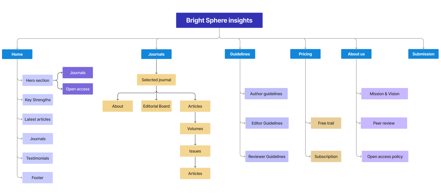
Research Methods

  • Studied some research journal websites

  • Reviewed article publishing patterns

  • Collected informal feedback from user

Key Insights

  • Users focus on article titles and abstracts first

  • Clear structure is important for publishing content

  • Filters help users find articles faster

  • Simple layouts increase trust and readability

Site map

The website was structured to support smooth article publishing and a comfortable reading experience through the following sections

Typography and Colours

Public Sans is a modern, open-source sans-serif typeface designed for clarity, neutrality, and readability — especially in digital interfaces and public-facing communications.

Public Sans

ABCDEFGHIJKLMNOPQRSTUVWXYZ

abcdefghijklmnopqrstuvwxyz

0123456789

#2879D0

Primary Colour

Secondary Colour

Text Colour

Background Colour

#143E6A

#393939

#FCFDFF

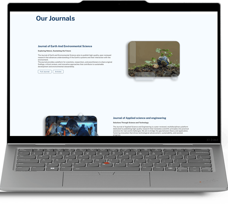
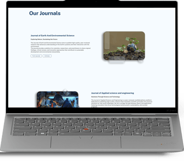
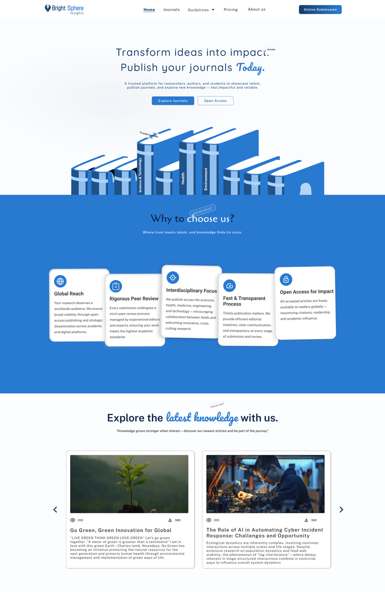
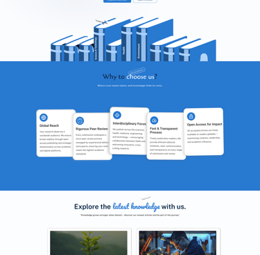
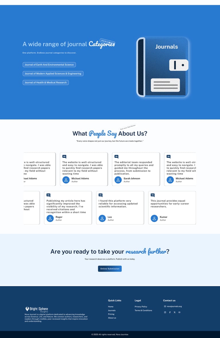
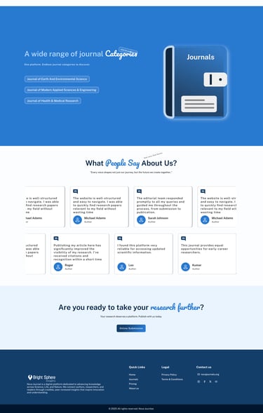
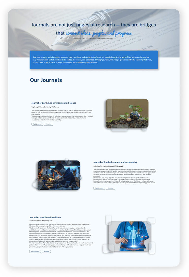
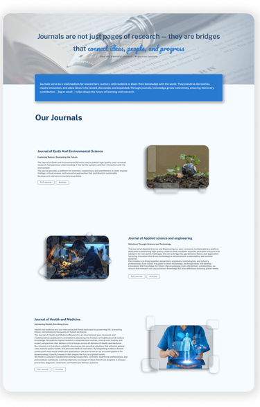
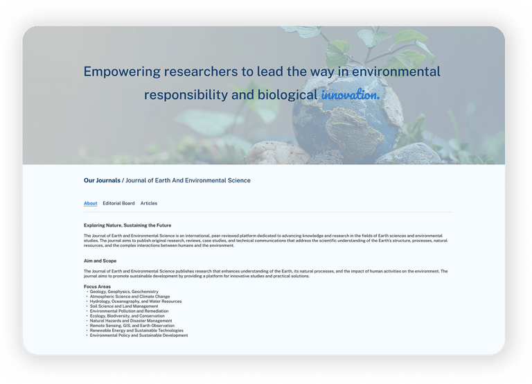
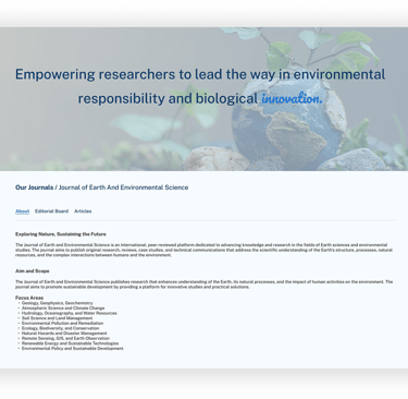
High Fidelity wireframes

  • Publishing platforms need strong structure

  • Simple UI improves trust for authors and readers

  • Clear hierarchy helps users read faster

  • Good UX reduces effort in content-heavy products

Thank you for your time :)

Learnings and Takeaways

Feel free to provide your valuable suggestion and comments